Slide Design Tips
Why should slide design matter to you? Because poor slide design distracts from your content and makes it less accessible. However, good slide design emphasizes your content – making it easier for students to remember. Thoughtful slide design reinforces your teaching and improves student learning.
Review the following points below when preparing your slide deck.
Text on Slides
After assembling your presentation slides, assess the content of each slide.
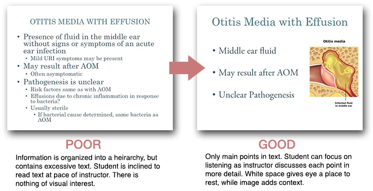
- Evaluate text by distinguishing main points from details
- Organize main points into bulleted lists
Important tip: Avoid more than 3 bullet points per slide - Focus on verbally communicating the details (i.e. reduce excess onscreen verbiage)
- Whenever possible, consider showing students an image instead of text
As you go through the above process for each slide, ask yourself: Is the text essential to comprehending the learning objectives?
If yes, then leave it. If no, remove the written content from the slide and instead talk the listener through the finer points & details verbally. Frame these points within the context of the more important bulleted written content.
Images
Strong images create visual interest. They are excellent for delivering complex information in a succinct manner. For more info from TEE on using images, read about why images matter and where to begin your online image search.
Type & Legibility
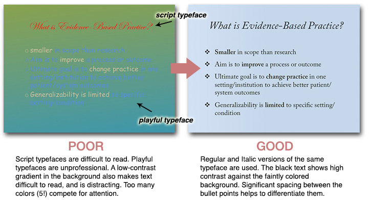
Onscreen text should be easy to read. Be thoughtful in your selection of type by following these basic design rules:
- Avoid unusual or quirky fonts
- Avoid boldly colored blocks of text; they can be difficult to read
- Text placed over an image can be difficult to read
- Avoid using a font size that is too small to read
Important tip: Don’t go smaller than 24 point for most fonts. If you you find yourself having to reduce the font size to fit more text onscreen, you should instead be considering the removal of significant text from your slide. - If you start with a specific typeface, make every effort to use it throughout your presentation for consistency
Note for PowerPoint users: Microsoft provides a number of professionally designed templates — explore them and give one a try. Try to avoid cramming more content onto your slide and breaking too much from the template layout! Decisions like spacing, size, and alignment of text were carefully considered when designers prepared these templates.
Visual Hierarchy
Pay attention to the way you place text & images on your slides.
If, by necessity, the text on a slide must be lengthy (which should be the exception rather than the rule), then organize the content by using headers and subheaders to give your slides more structure. Don’t go more than 2 levels deep on a single slide.
Type can be used to enforce additional structure on your slides, by either varying the size of the type, or its weight (e.g. Bold vs Regular)
Think about whitespace; it is your friend. Whitespace gives the eye a place to rest, and can aid in drawing the eye to important details via negative space. Whitespace will naturally be created through the process of decreasing the amount of text on your slide and streamlining the layout.
Contrast
Choose a color scheme and stick to it! Don’t choose color pairings that ‘vibrate’ onscreen (e.g. red text on a green background, yellow text on a white background). Avoid color pairings that are low contrast (e.g. dark grey text on a black background). If the contrast is low, legibility is decreased.
Incorporating Animations
Animations on slides should be used sparingly and purposefully. If you have time for animations, allow your text to slide or fade in as you talk through the points. This will prevent students from reading ahead of you on your slide content.
- Avoid gimmicky and distracting transitions
- If you must use a transition, then keep it simple with a 'Fade,' or 'Slide,' effect
Resources
For more information on UCSF identity standards, and to obtain branded templates, access the following:
